Painting in Troubled Times: Artworks by Théodore Géricault
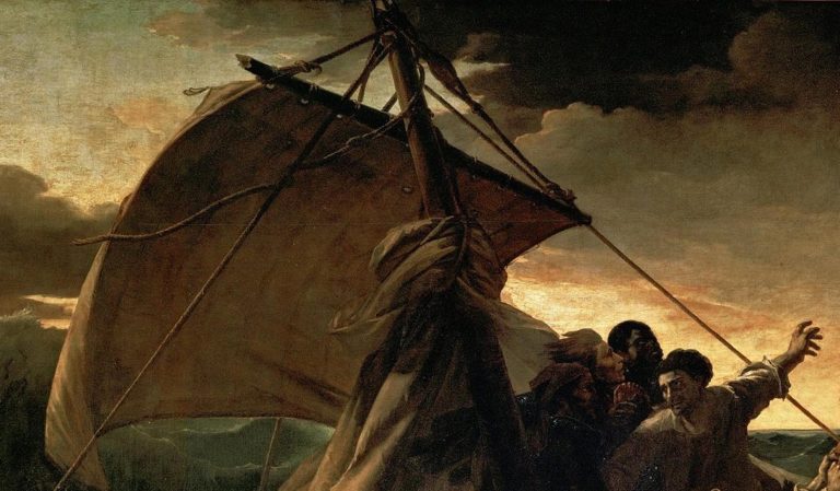
The French painter Jean-Louis André Théodore Géricault left this world at the age of 31, but it would be wrong to say he died young. He witnessed several social epochs – the bourgeois revolution, Napoleon Bonaparte’s dictatorship, and the Bourbon…